Redesigning patient flow for India's public healthcare system — from walk-in chaos to structured, dignity-preserving appointments.
Role
Product Designer · UX Researcher
Year
2025
Company
Independent Concept
Team
Personal Project
Tools Stack
Figma · FigJam · Miro · Google Forms
SwasthyaFlow introduced a structured appointment-first system across patient, doctor, and admin workflows. The platform included real-time queue tracking, multilingual support, and SMS notifications for low-literacy users on basic smartphones. The system was designed to reduce patient uncertainty and improve clinic efficiency, targeting a projected 40–60% reduction in OPD waiting time.
Government clinics in India largely rely on walk-in systems. Patients often wait several hours without knowing when their turn will arrive. For daily-wage workers, this uncertainty directly affects income and access to care. Doctors face overloaded schedules and unpredictable patient volume, leading to rushed consultations and operational inefficiency. While existing healthcare initiatives focused on medical records infrastructure, they did not address the actual appointment and waiting experience inside clinics.
01
Patients were more comfortable waiting when they had visibility into queue progress and estimated timing.
02
Low-literacy users still needed full functionality — delivered through icon-led navigation, local language support, large touch targets, and SMS communication.
03
Improving only the patient experience would not solve scheduling inefficiencies or consultation overload for physicians.
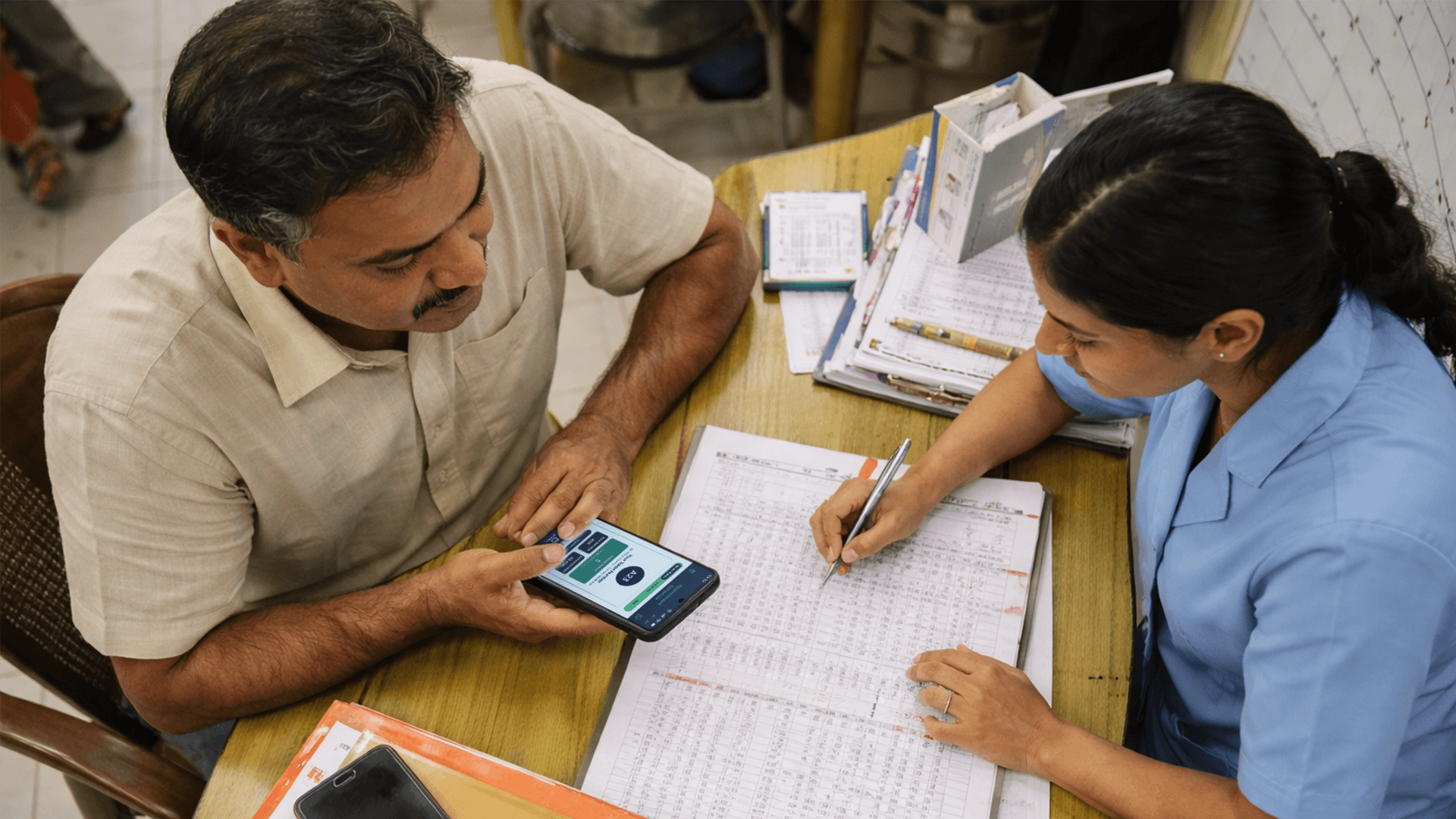
Walk-ins were limited rather than removed entirely to preserve accessibility for emergency and offline patients. A lightweight onboarding flow reduced friction and improved accessibility for first-time users. The home screen prioritized live queue position, wait estimates, and appointment progress instead of feature navigation. Patients received appointment reminders and queue alerts through SMS without needing the app open. Appointment limits were managed at the doctor level to prevent overload and improve scheduling balance.
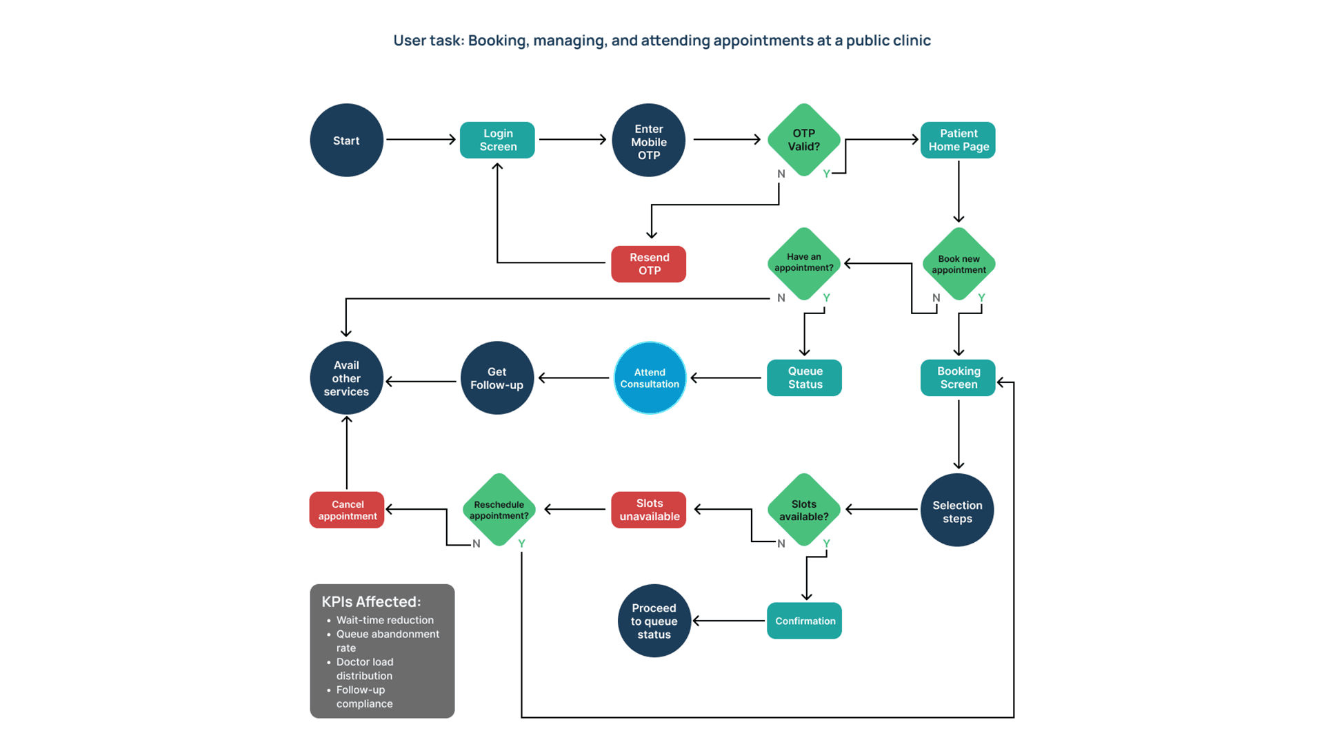
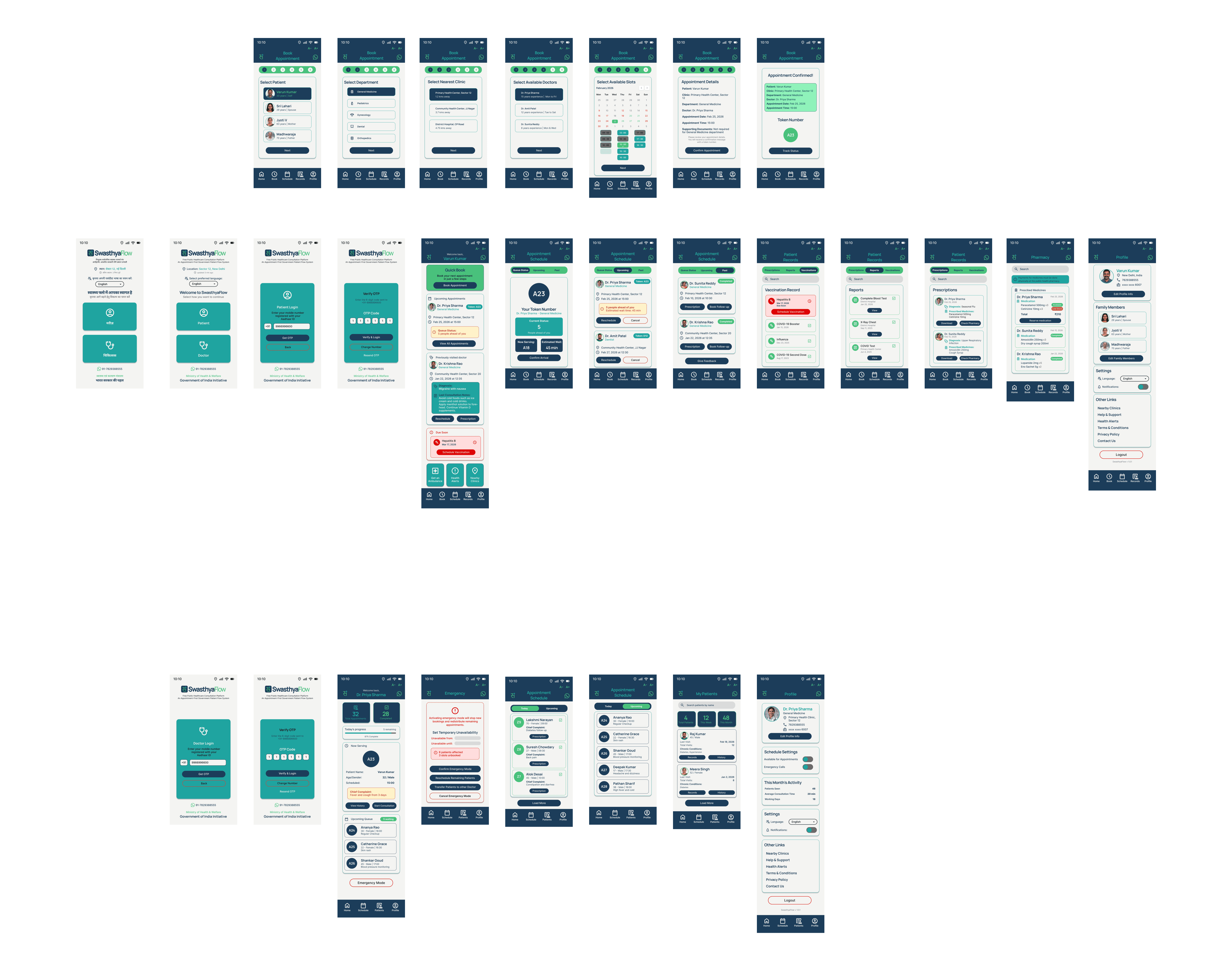
The platform connected five workflows into a single healthcare system: patient booking, queue tracking, doctor scheduling, clinic administration, and follow-up management. The booking experience followed a progressive disclosure approach where users selected a clinic, department, doctor, and time slot step by step to reduce cognitive load. The queue tracking experience became the core product surface, showing live queue position, wait-time ranges, and appointment progress in real time. Doctors received structured schedule dashboards with patient previews and follow-up management tools, helping them prepare for consultations in advance. SMS reminders and notifications ensured patients could stay updated even without actively using the app.
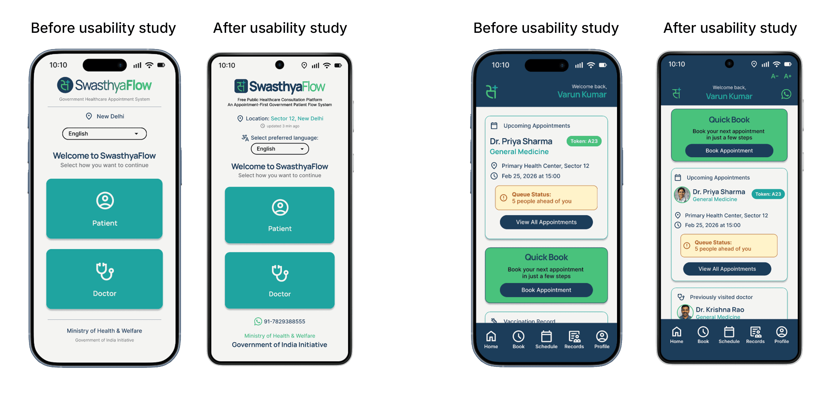
Designing SwasthyaFlow required balancing operational efficiency with accessibility. A fully appointment-based system would improve scheduling predictability but risk excluding patients who rely on same-day visits, so limited walk-in slots were preserved for emergency and offline access. The product also balanced feature depth with usability by removing non-essential healthcare features that could overwhelm low-literacy users. Another key trade-off was between digital-first and digital-inclusive design. While the app streamlined appointment management for smartphone users, SMS notifications and counter-based token support ensured patients without smartphones could still benefit from the system.
01
Projected reduction in patient wait time based on slot utilization modelling
02
Improvement in doctor schedule utilization efficiency
03
User personas tested across 8 usability sessions
This project highlighted how public-sector UX differs from commercial products. In healthcare, poor usability can directly affect access to care. The most important design shift was focusing on reducing uncertainty rather than only reducing wait time. That single reframing shaped the entire product experience.
Check out the next project
Project Atlas rebuilt a complex 6–8-hour production workflow into a scalable 90-minute AI-assisted pipeline without sacrificing human quality control.