Project LabelLens is a scalable OCR-to-localization workflow that translated packaging across global marketplaces without breaking the visual trust built into the original label design.
Role
Senior Product Designer
Year
2025
Company
Amazon — Visual Innovation Team
Team
5 Designers (led) · QA Team · Editor · Seattle PM · Senior AI Team
Tools Stack
Figma · Adobe Creative Suite · Amazon Rekognition · SageMaker · AWS Bedrock · Amazon Translate · AWS Lambda
Project LabelLens improved multilingual product comprehension, reduced projected label-related returns, and introduced layout-preserving localization workflows across global marketplaces.
International customers often struggled to understand product packaging across health, skincare, cosmetics, and food categories where label clarity directly influenced trust and purchase confidence. Generic translation APIs failed under real-world conditions; ingredient terminology, dosage language, and regulatory phrasing became contextually misleading, while broken layout hierarchy disrupted readability and comprehension.
01
Most product labels are image-based, which means standard translation APIs can't touch them.
02
Misread dosage or ingredient information drives returns that are hard to attribute and fix.
03
Health, food, and beauty had the highest category volume, which made them the highest-stakes place to get this wrong.
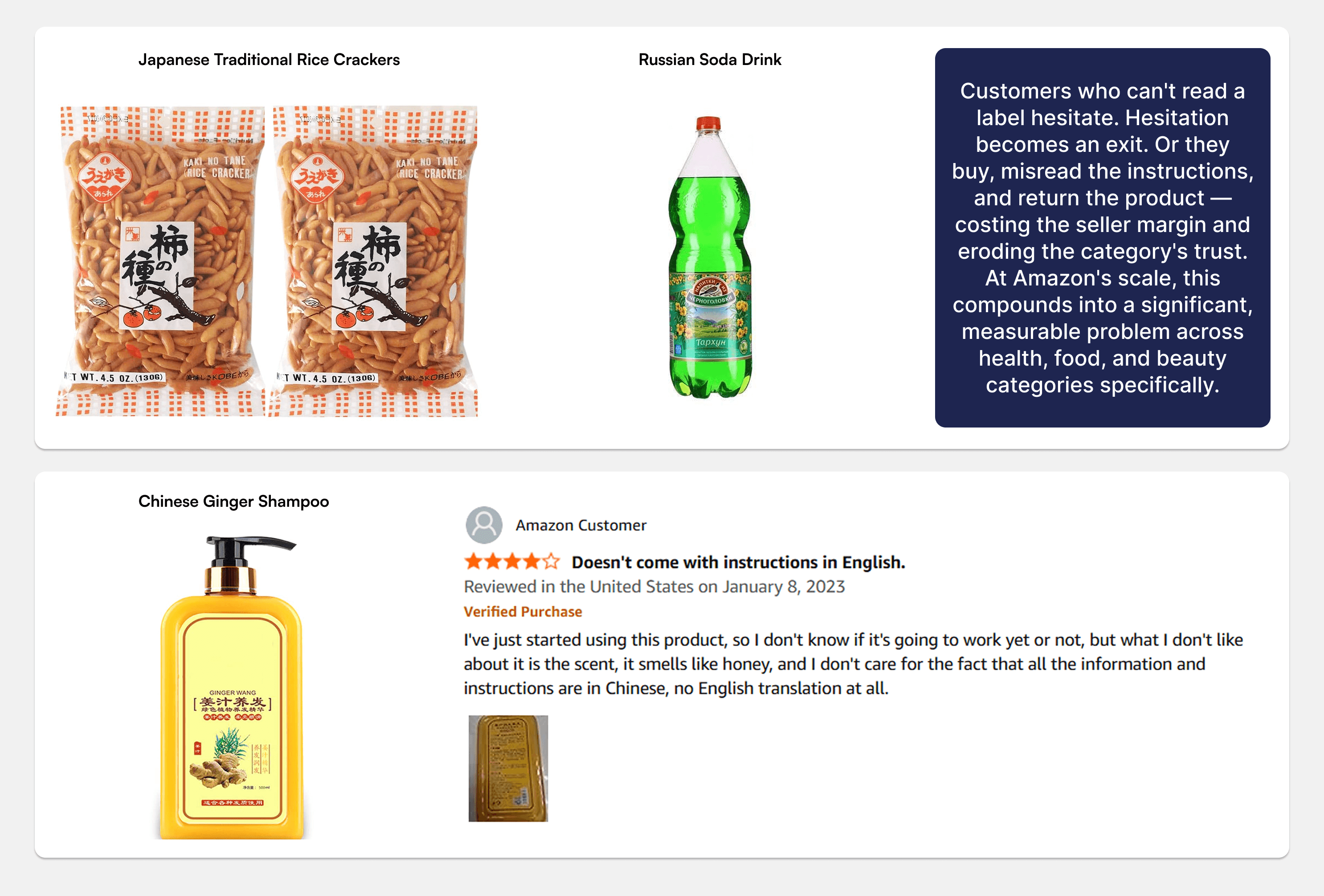
LabelLens prioritized domain-specific translation systems over generic APIs because health, beauty, and food categories required contextual interpretation rather than literal translation. Preserving layout hierarchy became equally important. The system maintained typographic structure, emphasis patterns, and visual scanning order during localization to preserve comprehension and trust. Side-by-side review systems and mandatory human validation checkpoints were integrated early for dosage instructions, allergen warnings, and other safety-critical content where operational risk outweighed throughput efficiency.
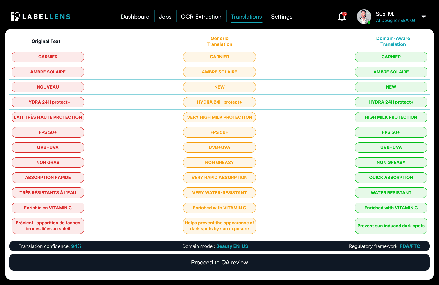
The workflow operated across four stages: OCR extraction, context-aware translation, validation, and layout reconstruction. OCR was optimized for dense packaging layouts with mixed scripts, multi-column structures, and vertical CJK text where generic systems failed. The validation layer surfaced confidence scores and escalation triggers directly inside the QA workflow, while the reconstruction layer preserved original layout hierarchy across different languages and text lengths. The goal was not visibly translated packaging, but invisible localization.
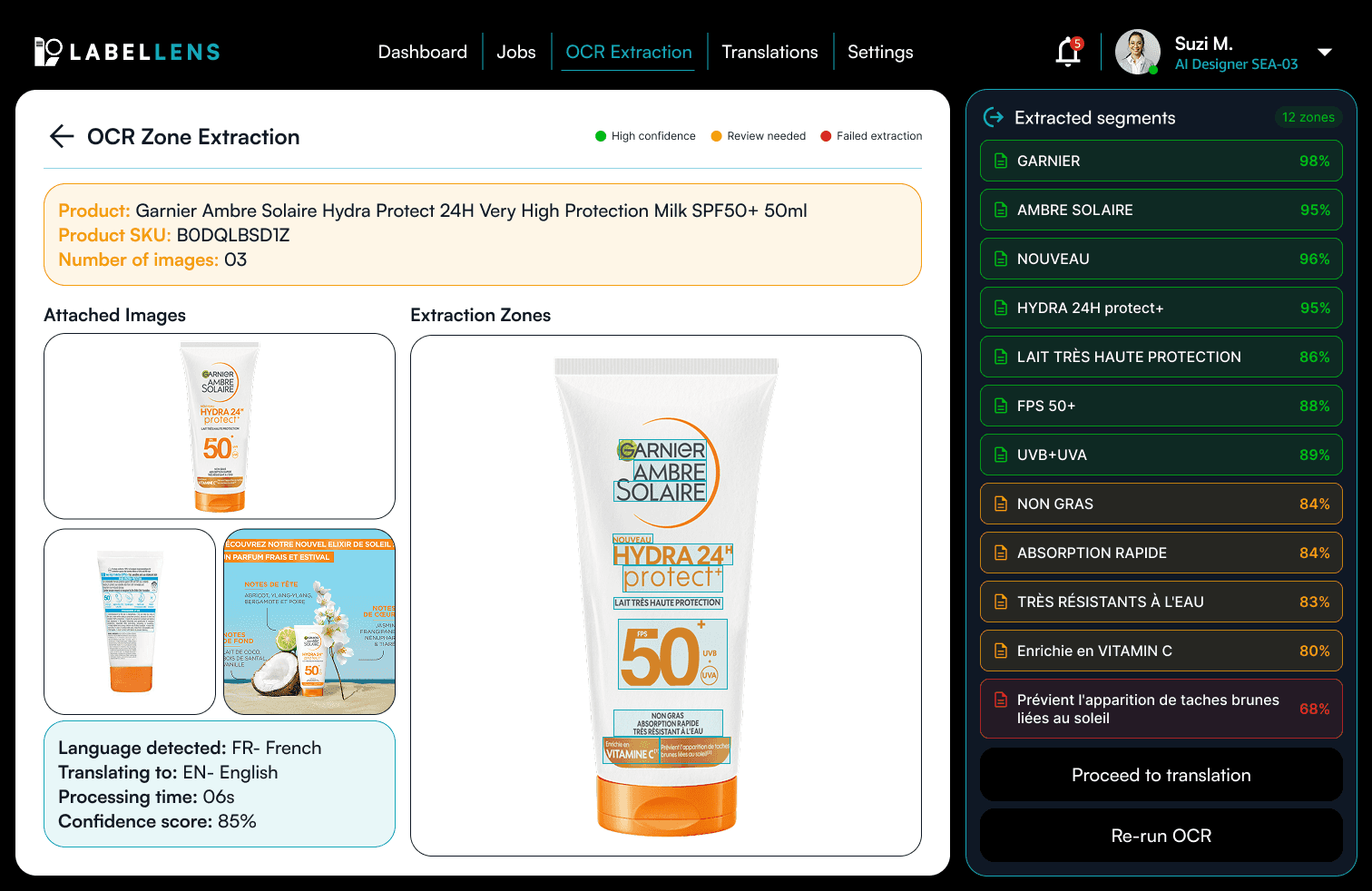
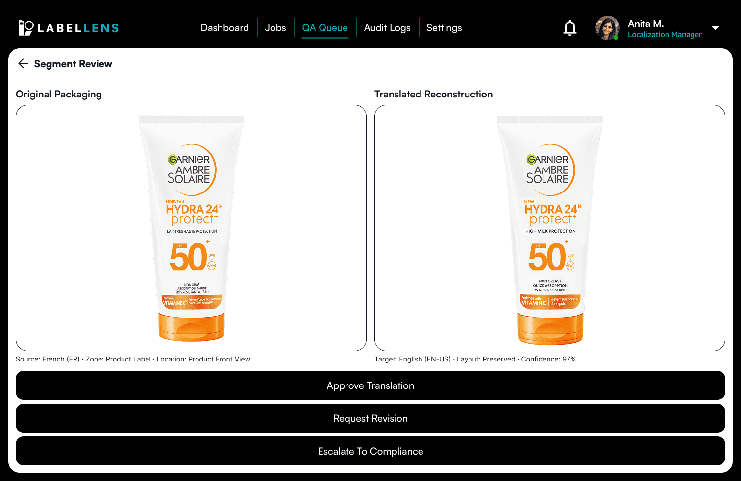
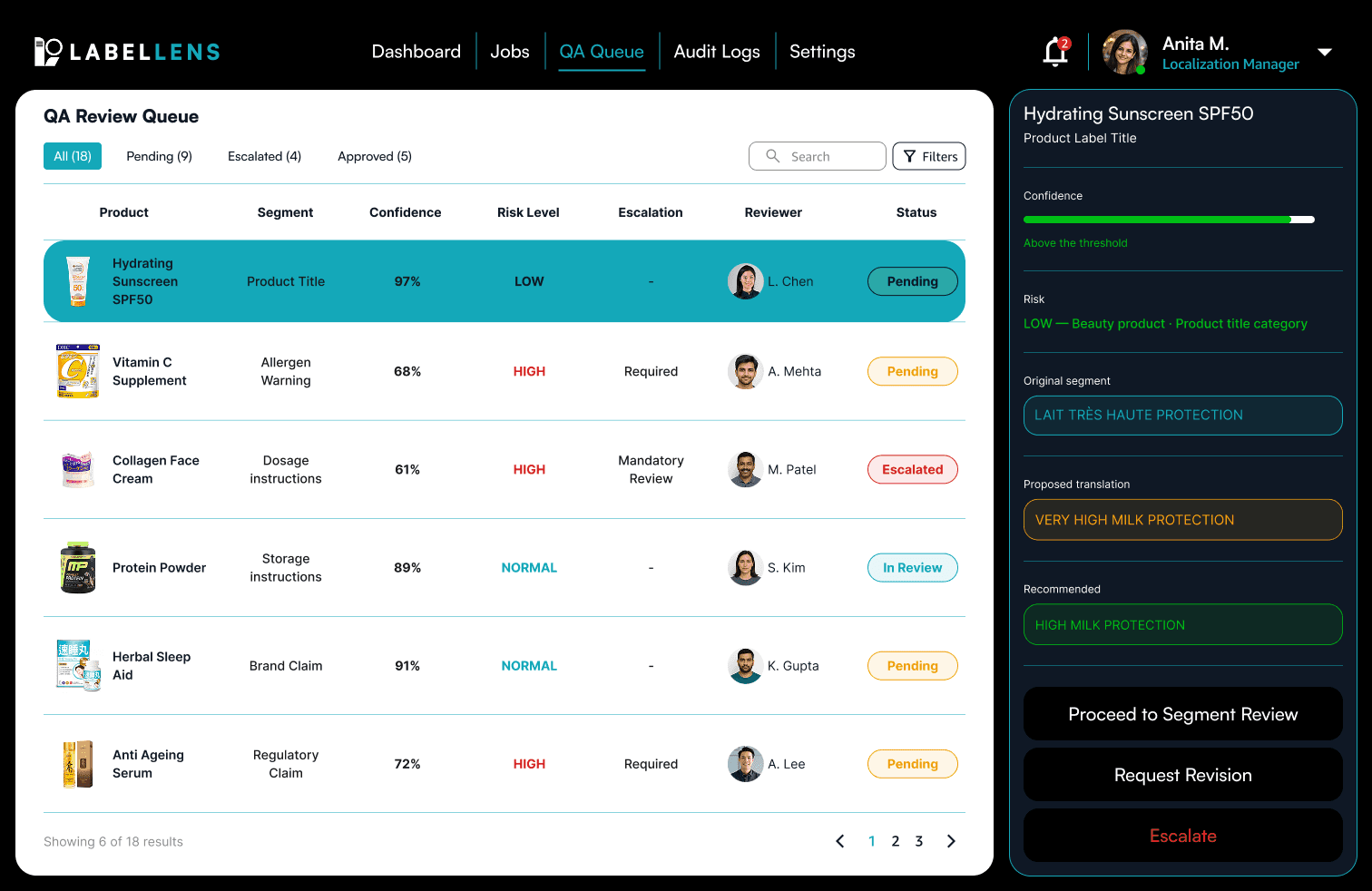
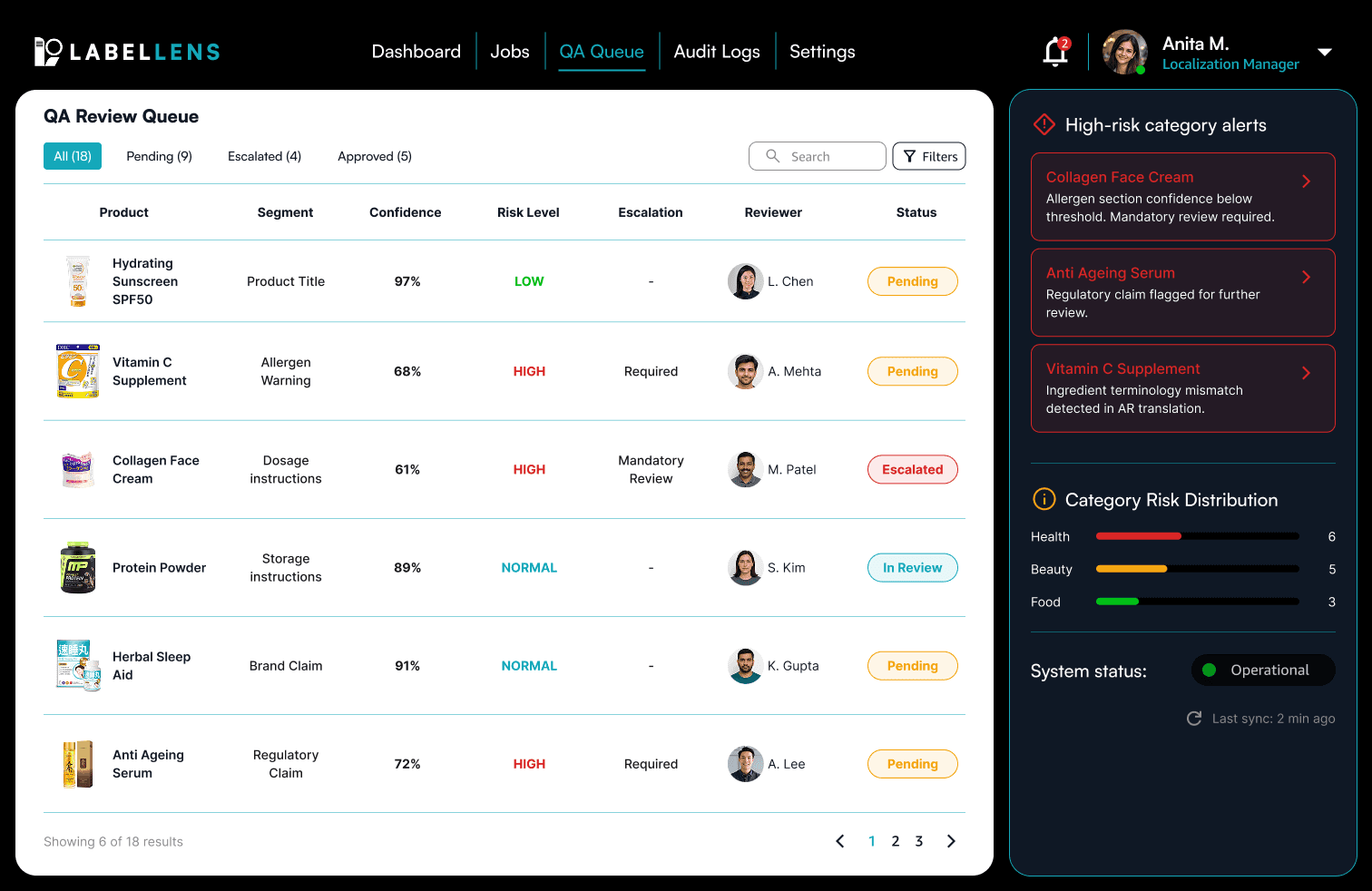
Generic APIs shipped faster but introduced unacceptable ambiguity in high-risk categories. Mandatory human validation improved operational safety while increasing latency inside the workflow. Preserving visual hierarchy required substantially more technical complexity than simple text replacement but proved essential for maintaining customer confidence. One of the more important decisions was prioritizing edge cases early like mixed-language packaging, dense ingredient tables, vertical scripts, and regulatory-heavy layouts. Solving those constraints first clarified the real architectural complexity of the project before implementation scaled further.
01
faster product comprehension for non-native language customers
02
projected reduction in returns caused by label misreads
03
increase in accessibility for previously unreadable labels
This project changed how I think about information clarity inside international systems. Correct information alone isn’t enough. If users cannot confidently process that information visually, trust still collapses. The system ultimately succeeded when translated packaging stopped feeling translated and simply felt understandable.
Check out the next project
A museum experience designed around visitor orientation, narrative pacing, and cognitive clarity instead of institutional information architecture.