A museum experience designed around visitor orientation, narrative pacing, and cognitive clarity instead of institutional information architecture.
Role
Product Designer · UX Researcher
Year
2025
Company
Independent Concept
Team
Personal Project
Tools Stack
Figma · Miro · Adobe Creative Suite · Google Forms
The project restructured museum discovery and booking workflows, improved exhibition engagement depth, and reduced visitor cognitive overload through calmer navigation and accessibility-first planning systems.
Most museum apps are structurally complete but experientially fragmented. Visitors can technically buy tickets, read exhibition descriptions, and navigate event schedules while still feeling uncertain about where to begin, how much time to allocate, or whether the experience will feel manageable. The deeper issue was cognitive orientation.
01
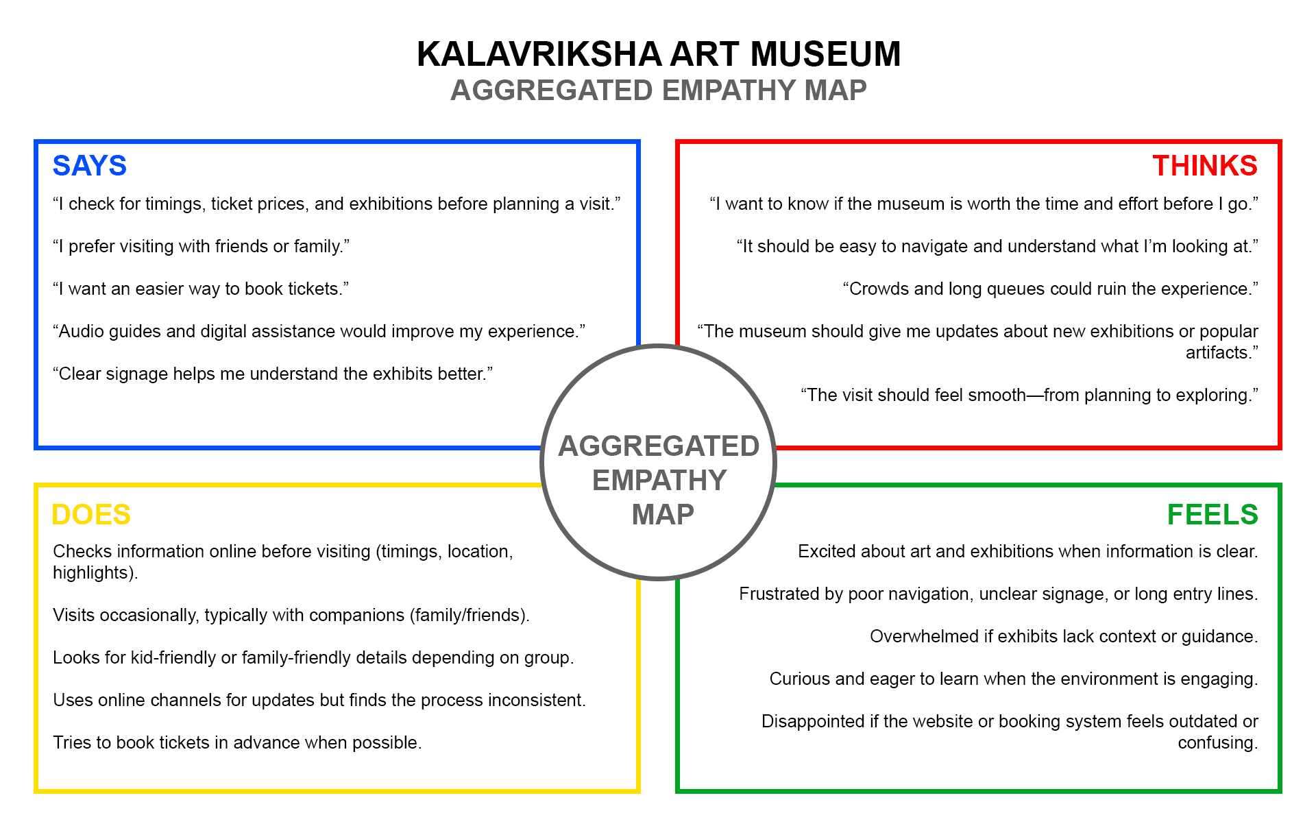
Families needed predictable planning infrastructure like group coordination, timing estimates, and what to expect.
02
Senior visitors struggled with navigation clarity and accessibility information that was buried or assumed away.
03
Tourists depended heavily on mobile guidance and contextual information during the visit, not just before it.
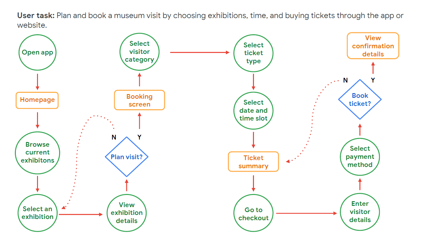
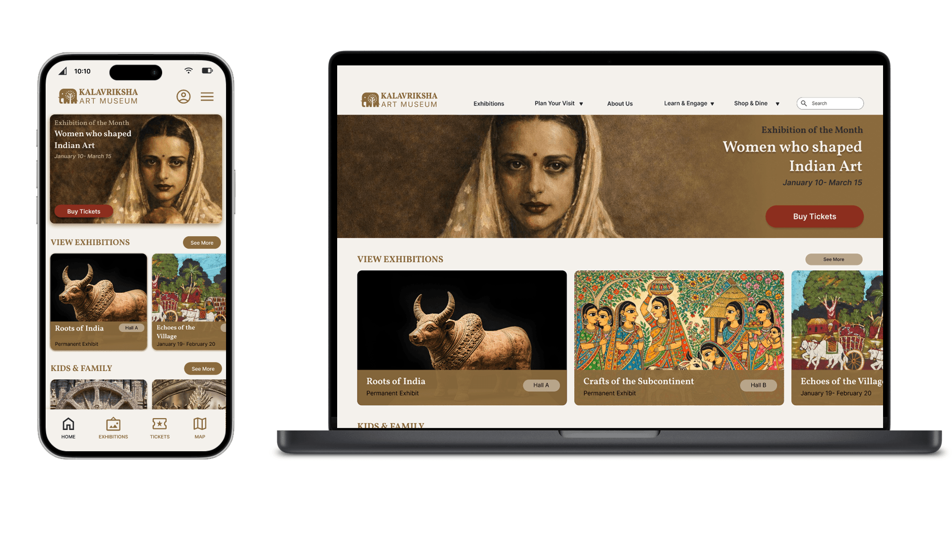
The most important structural decision was placing discovery before conversion. Exhibitions, storytelling, and contextual orientation became the entry point, while ticketing appeared only after users developed intent and familiarity. Early iterations overloaded users with dense curatorial descriptions and metadata that were consistently skimmed or ignored.
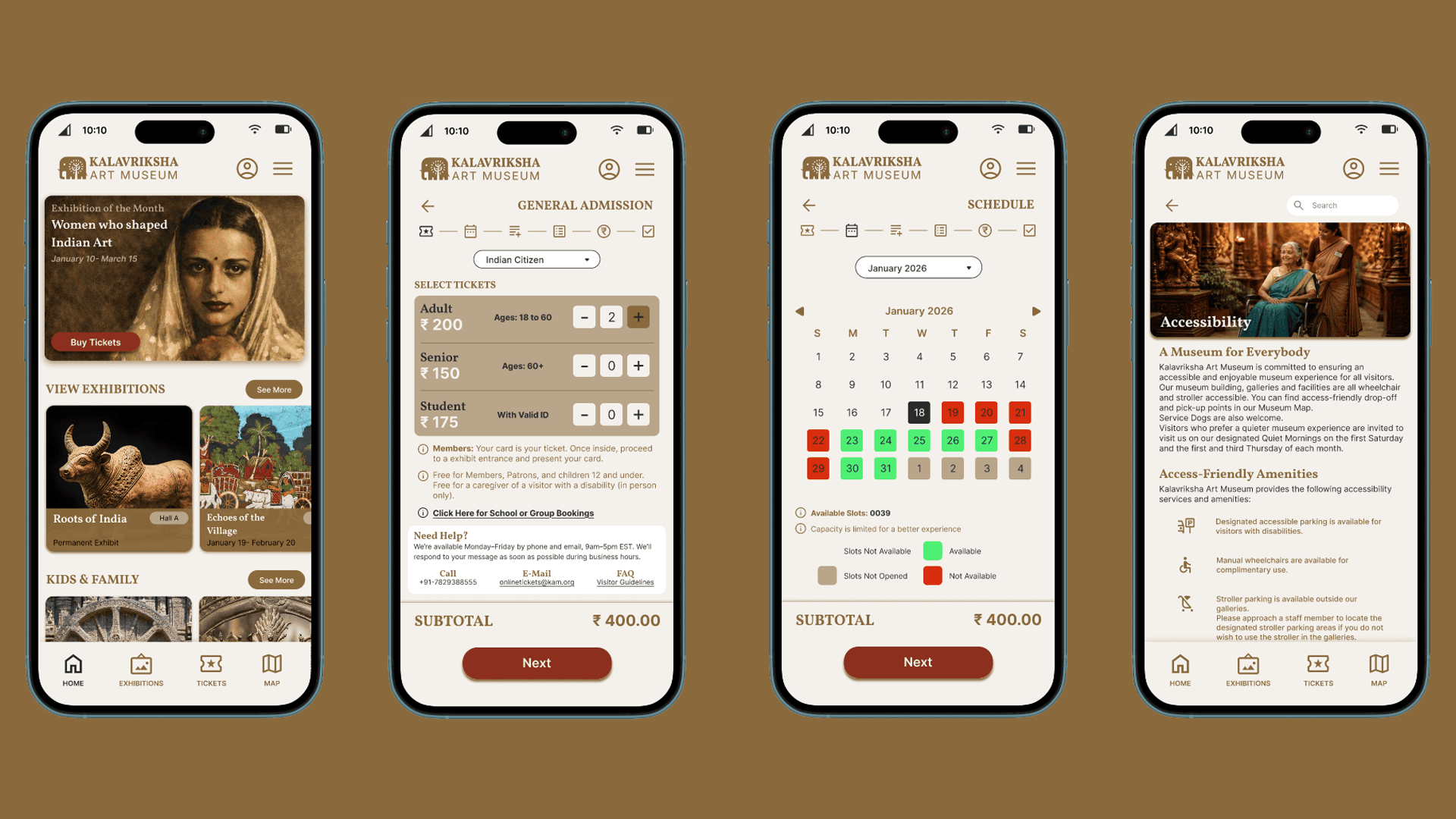
The final system prioritized progressive disclosure, stronger visual hierarchy, and contextual depth only when users intentionally explored further. Accessibility was integrated directly into the core experience, surfacing quiet spaces, multilingual guidance, navigation assistance, and audio support contextually throughout the visitor journey.
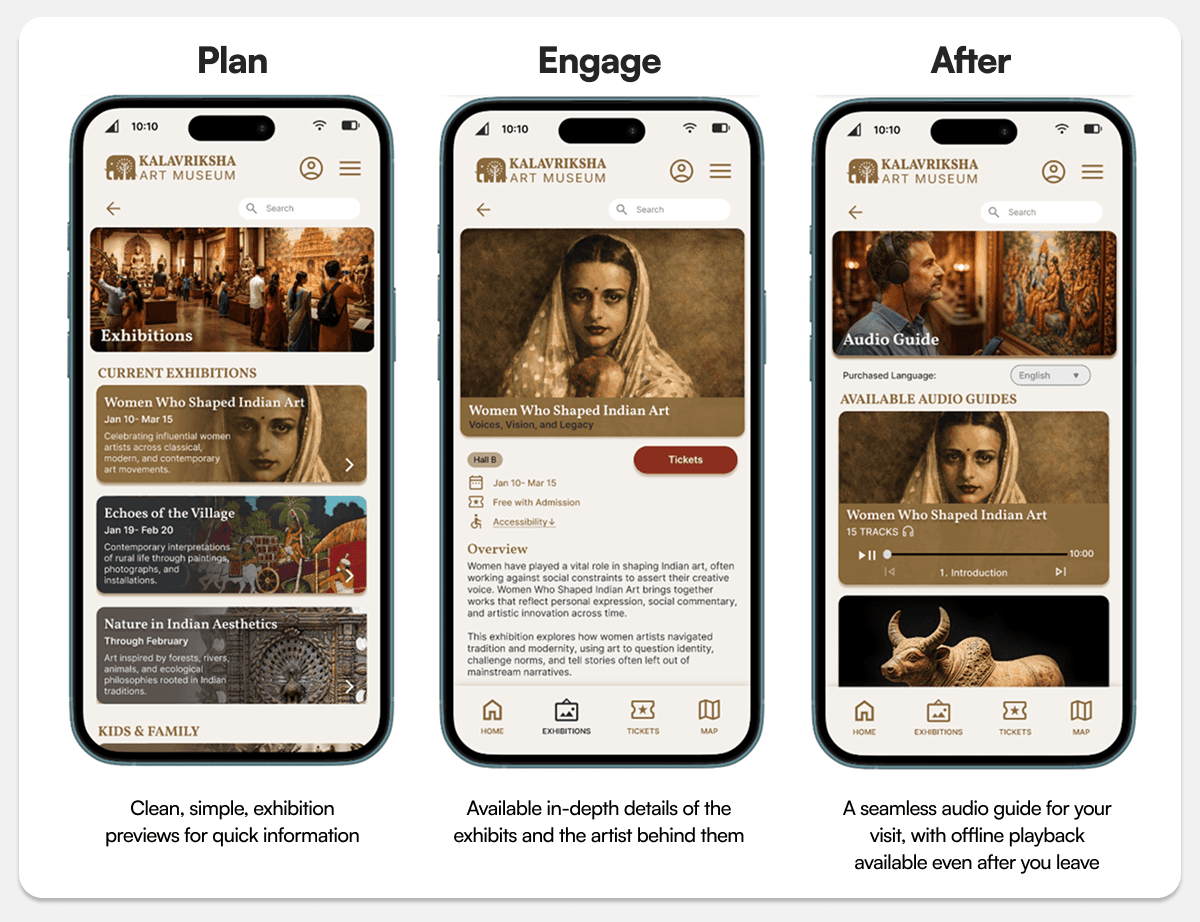
The product connected exhibition discovery, planning, ticketing, navigation, audio guidance, and accessibility systems into one continuous visitor flow. The audio-guide system became unexpectedly important during usability testing because it reduced orientation anxiety inside unfamiliar cultural spaces. Users described the guidance system less as an informational tool and more as a confidence layer that helped them engage more comfortably with the museum environment itself.
One of the more subtle workflow decisions involved pacing. The product intentionally slowed certain interactions down like reducing interface density, simplifying choices, and introducing breathing room between actions. The system was designed to support curiosity without overwhelming users with constant informational pressure.
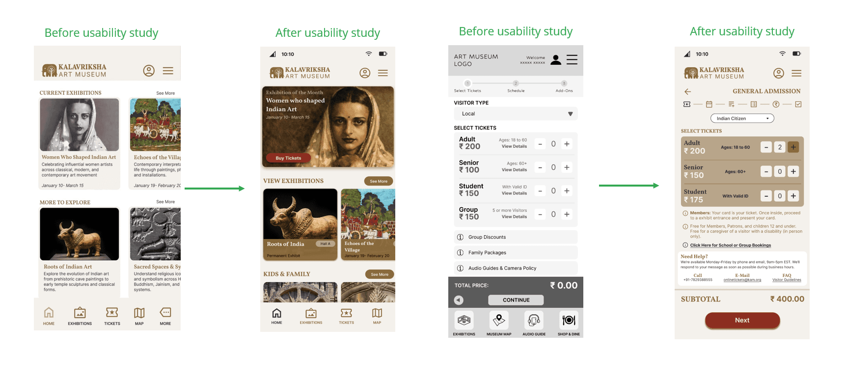
The project constantly balanced richness against clarity. Reducing curatorial density improved comprehension but required difficult editorial decisions around what information deserved prominence. Feature expansion created similar tension. Many individually reasonable ideas were intentionally rejected because they fragmented the coherence of the visitor experience.
The project also revealed that guidance systems can accidentally create performance anxiety if they become too instructional. Audio systems and educational layers were intentionally redesigned to feel optional and assistive rather than prescriptive.
01
increase in ticket booking completion rate after flow restructure
02
increase in exhibition content engagement depth
03
usability sessions across family, senior, and tourist user groups
Kalavriksha reinforced that restraint is one of the hardest design skills to maintain as products grow. The instinct to continuously add information, features, and guidance is usually well-intentioned but often counterproductive. The strongest moments in the product emerged when the interface quietly stepped aside and allowed the visitor to feel oriented without feeling managed.
Check out the next project
Rebuilt a fragmented 6–8-hour production workflow into a scalable 90-minute AI-assisted pipeline without sacrificing human quality control.