A financial decision-support system designed around one idea: people don’t need more financial data, they need better financial orientation.
Role
Product Designer · UX Researcher
Year
2026
Company
Independent Concept
Team
Personal Project
Tools Stack
Figma · FigJam · Adobe Creative Suite · Miro · Notion
The project introduced a unified financial orientation system across five connected workflows, designed 31 production-ready screens, and created a contextual AI guidance layer focused on reducing decision fatigue instead of increasing engagement noise.
Modern users manage finances across fragmented ecosystems of banking apps, investments, subscriptions, insurance, UPI systems, and loans. Most finance products surface large amounts of data while failing to answer the question users actually care about: “Am I doing okay financially?” The problem was cognitive overload, not lack of information. Existing finance apps optimized for tracking and analytics while leaving users with more dashboards but less confidence.
01
Users wanted financial guidance, not more data visualization.
02
Financial anxiety tracks more closely with uncertainty than with actual income levels.
03
Most finance apps are optimized for tracking behaviour, they rarely support forward-looking decisions.
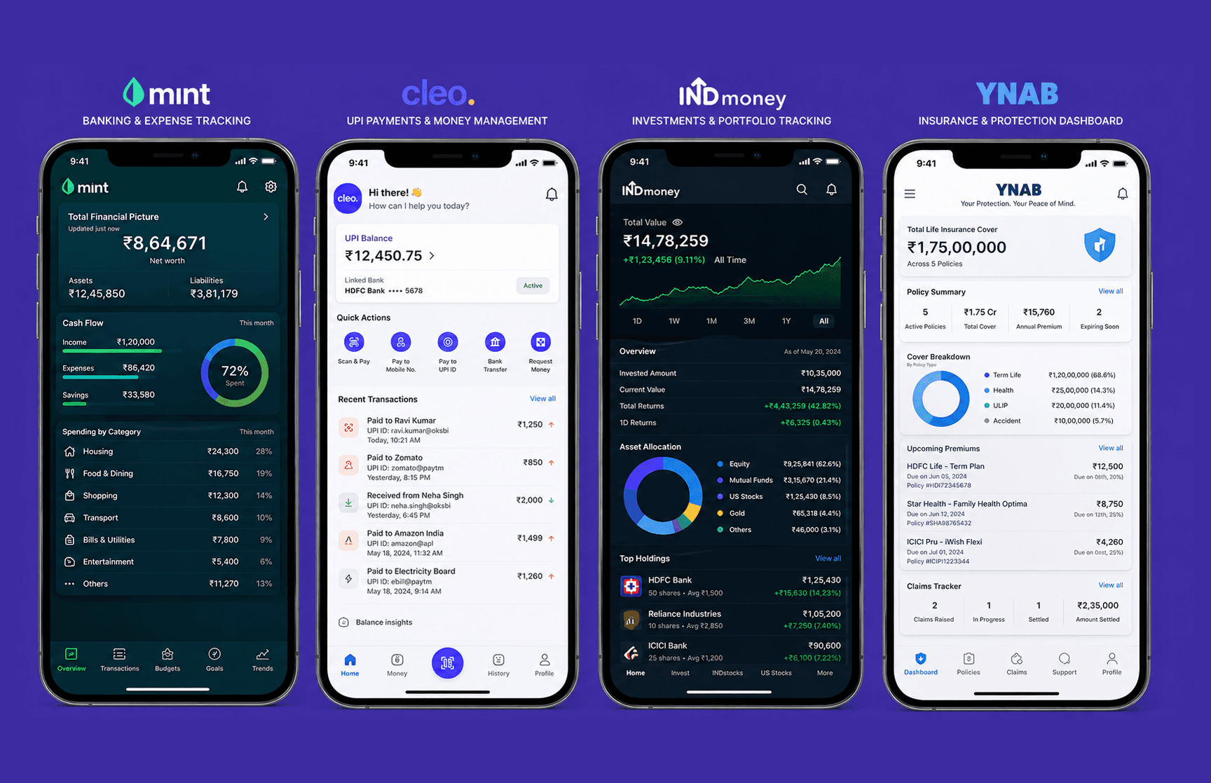
The AI Copilot was intentionally designed as a contextual guidance layer rather than a conversational chatbot, appearing only during overspending patterns, goal-risk states, unusual activity, or predictive adjustments. The Financial Health Score introduced a similar challenge: simplifying financial complexity without becoming misleading. Instead of acting as a performance grade, the score functioned as a continuously updating orientation layer, using progressive disclosure to surface clarity first while allowing deeper exploration when needed.
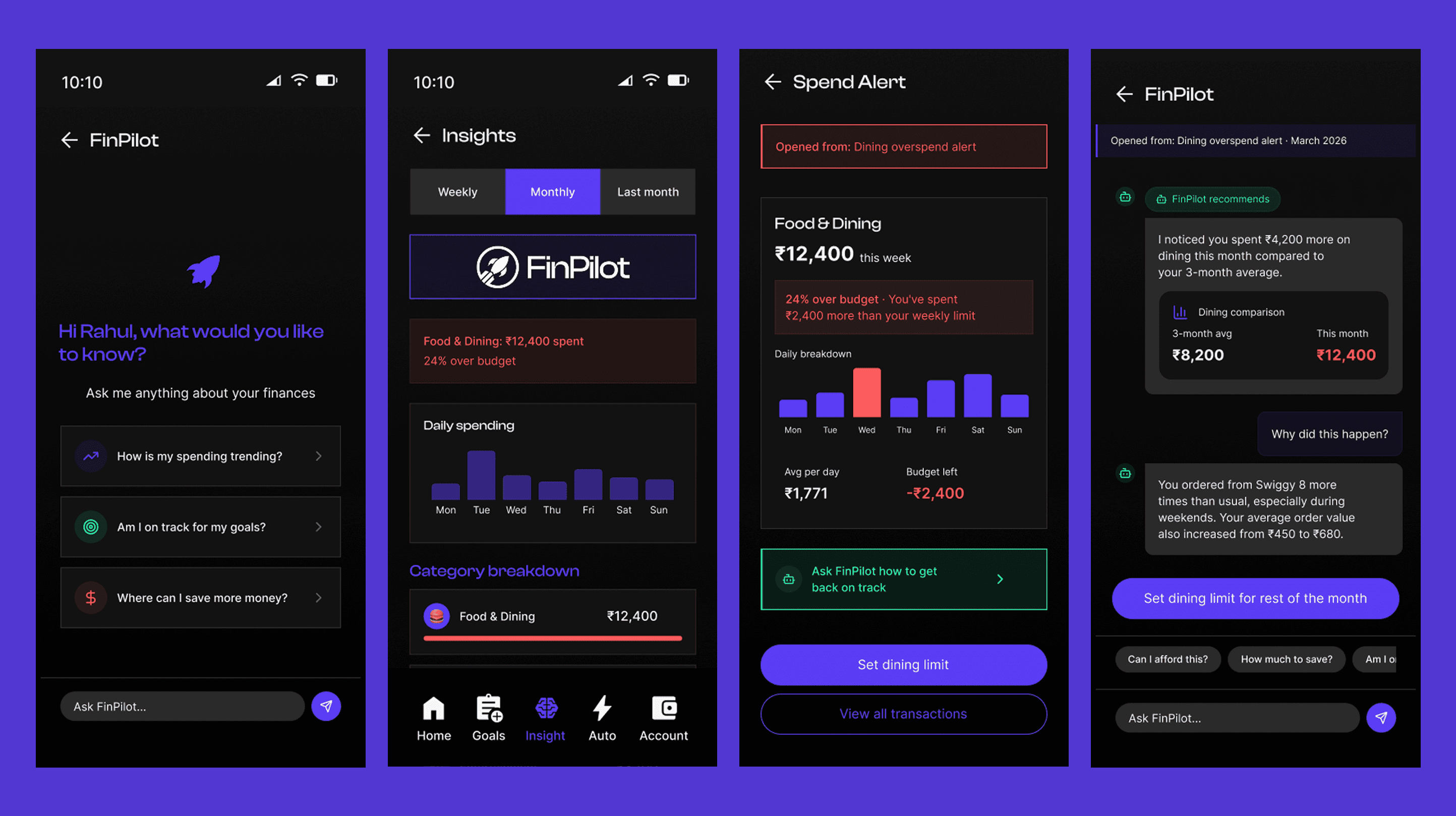
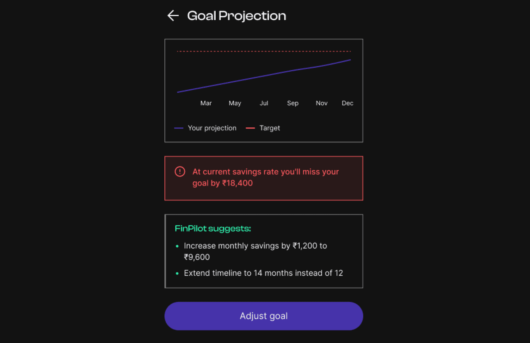
The product connected onboarding, AI guidance, planning systems, predictive simulations, notifications, and automation into one continuous workflow instead of isolated feature clusters. Error states and edge cases received equal design attention because financial anxiety often appears during moments of instability, not successful flows. A key interaction pattern was the Predictive Simulator, which reframed failed goals as adjustable plans by extending timelines, rebalancing savings, or restructuring targets instead of treating them as personal failure.

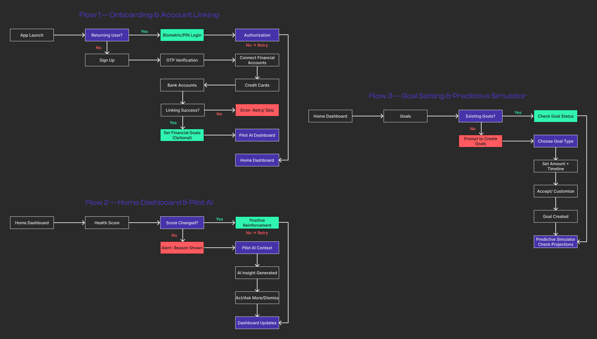
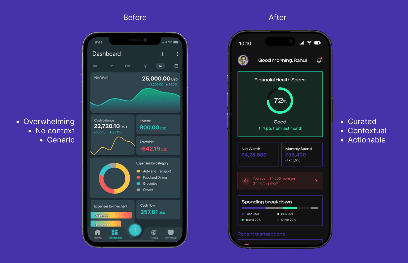
The project balanced transparency against cognitive overload. More financial detail improved visibility but also increased anxiety and decision fatigue. The final system reduced visible complexity while preserving deeper access through progressive disclosure. The AI layer followed similar restraint; instead of constant conversational interactions, the system prioritized contextual precision and timely guidance to maintain clarity and trust.
01
production-ready screens across 5 connected workflows
02
distinct AI Copilot entry points, each contextually triggered
03
error-state and edge-case coverage including the flows most apps don’t design
The project reinforced that financial products are fundamentally emotional systems disguised as utility products. Most users don’t actually want to manage finances. They want confidence that things are stable and understandable. The strongest moments in FinPilot were rarely the most visually complex screens, they were the moments where the product quietly reduced uncertainty before users consciously recognized it.
Check out the next project
Designed a scalable OCR-to-localization workflow that translated packaging across global marketplaces without breaking the visual trust built into the original label design.
