
Kalavriksha Art Museum
Kalavriksha Art Museum is a mobile-first digital experience designed to help visitors discover exhibitions, plan visits, book tickets, and navigate the museum seamlessly.
The project ran from December 2025 – January 2026
The goal was to move beyond an informational website and create a unified, visitor-centered digital journey that supports users before, during, and after their museum visit.
Insight
User research changed my viewpoint. At first, I thought ticket booking was the main problem.
But interviews and surveys showed a wider range of emotional challenges:
Visitors hesitate to commit because they aren’t sure if the visit is “worth it.”
Families worry about long waits and confusion.
Seniors find it hard to read and navigate.
Tourists depend entirely on clear mobile information.
Students seek affordable access and support for learning.
Key Insight:
The real issue wasn’t booking; it was cognitive overload and a lack of clear guidance.
Users don’t just want tickets.
They want confidence.
Strategy
I positioned the app as a calm, guided museum companion.
Design principles:
Progressive disclosure to reduce overwhelm.
Strong visual hierarchy.
Clear action-first pathways.
Cultural richness without clutter.
Accessibility by default.
Mobile-first thinking.
Instead of an information-heavy platform, I designed a flow-first experience.
Structure
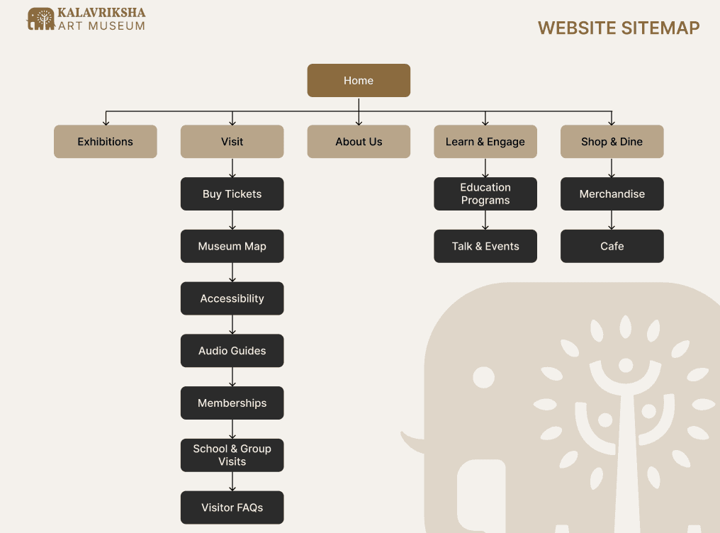
Information Architecture
The sitemap includes:
Exhibitions
Visit (Tickets, Map, Accessibility, Audio Guides)
Learn & Engage
Shop & Café
Memberships
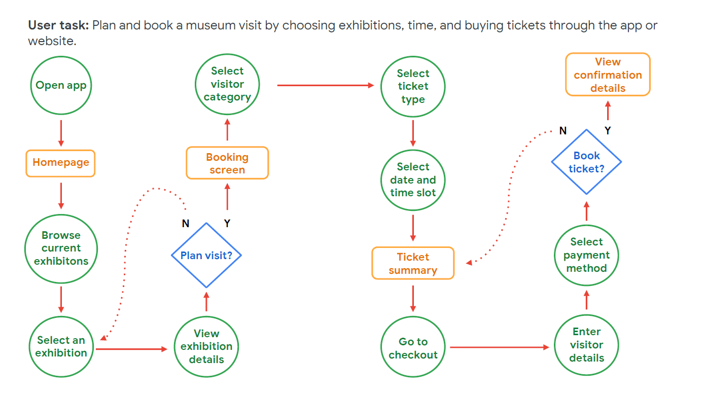
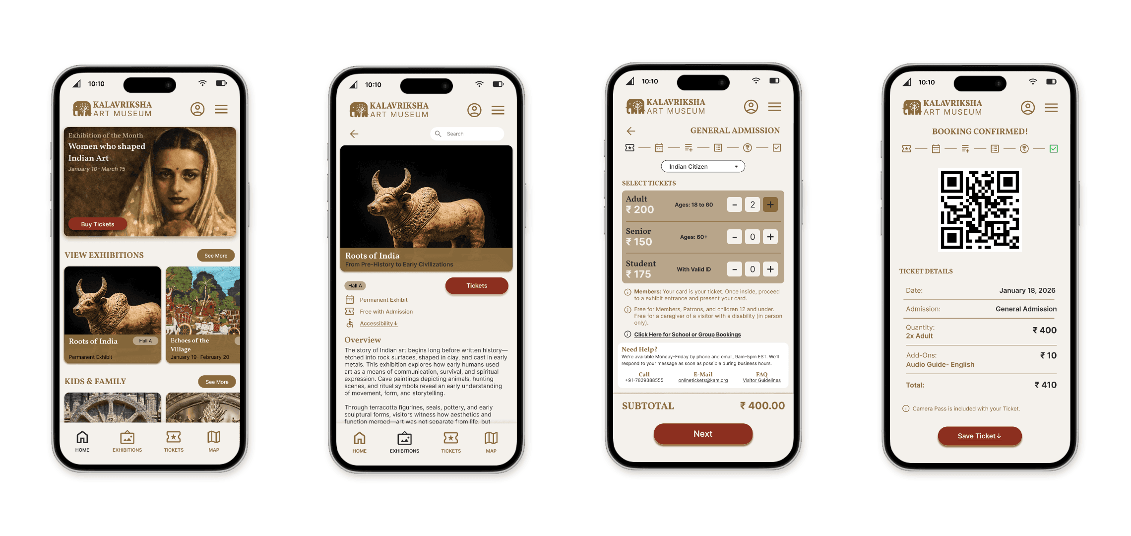
Main User Flow
Open App → Browse Exhibitions → View Details → Plan Visit → Select Ticket → Choose Date → Add-ons → Payment → Confirmation
The flow map clearly lays out this journey and decision points (see user flow diagram in project deck). This setup ensured:
No dead ends
Clear CTA hierarchy
Logical step progression
Decisions
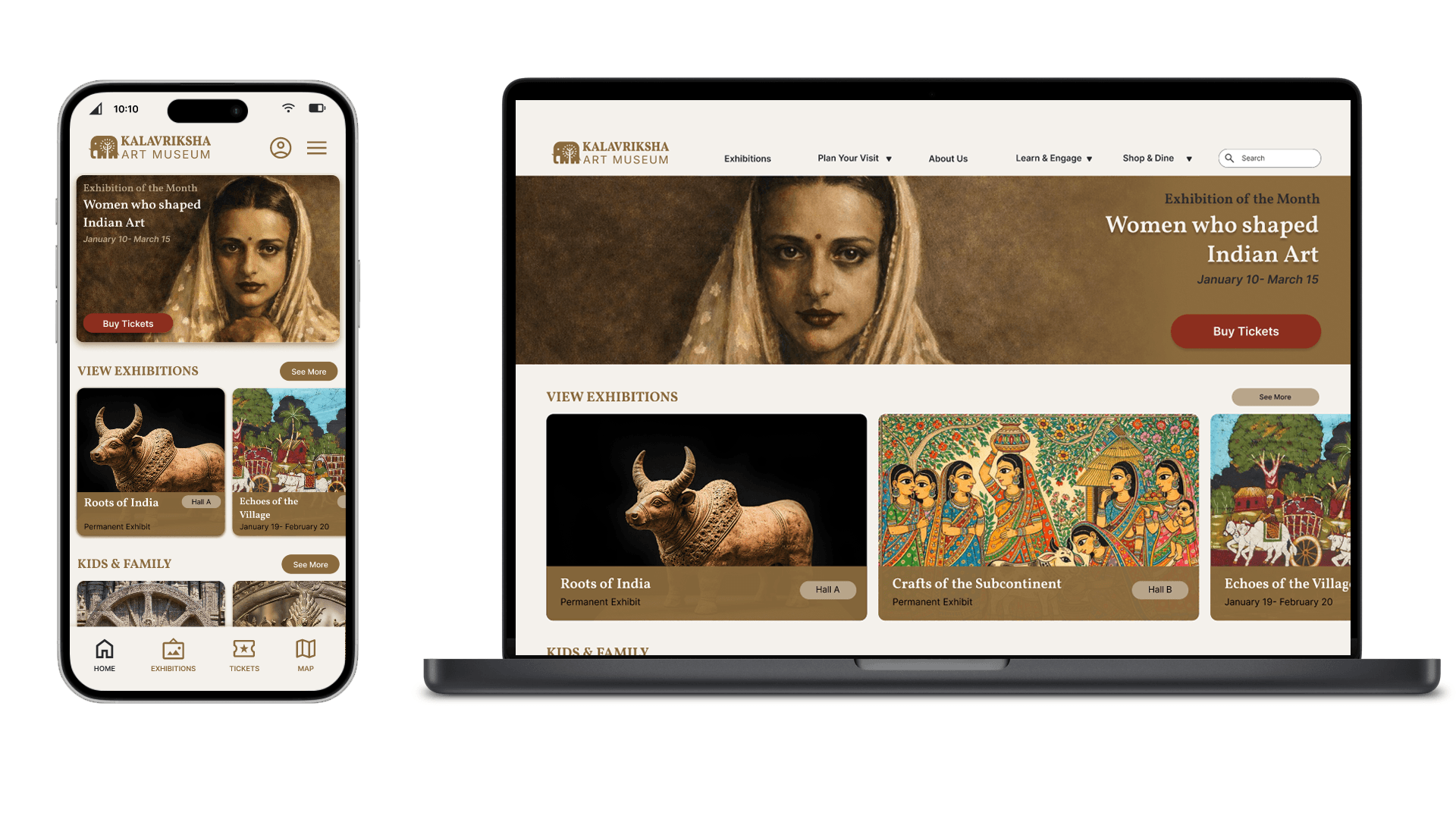
Homepage Hierarchy Shift
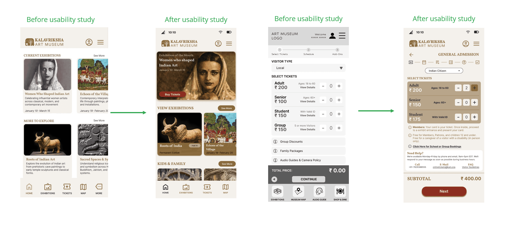
Before usability testing, the homepage lacked clear visual priority, with equal weight given to all elements and a vague “Explore” CTA. After refinement, “Buy Tickets” was emphasized, the hero exhibition was prioritized, and visual grouping improved. Reducing distractions made the interface clearer and easier to scan.
Ticket Booking Simplification
The original booking flow felt dense, with confusing group pricing and over-emphasized add-ons. The revised version simplified categories, clarified quantity controls, kept the subtotal visible, and made add-ons optional. A stronger “Next” CTA improved clarity and reduced cognitive load.
Accessibility Enhancements
Accessibility improvements included higher contrast, stronger emphasis on key details like dates and prices, larger touch targets, and clearer section separation. Audio guide integration and multilingual captions further enhanced inclusivity and usability.
Contextual Exhibition Pages
Exhibition pages now balance depth and clarity by including “Why it matters,” “What you’ll experience,” practical details, and a clear ticket CTA. This structure supports diverse users, from art enthusiasts to travelers and students, by combining context with action.
Validation
Research
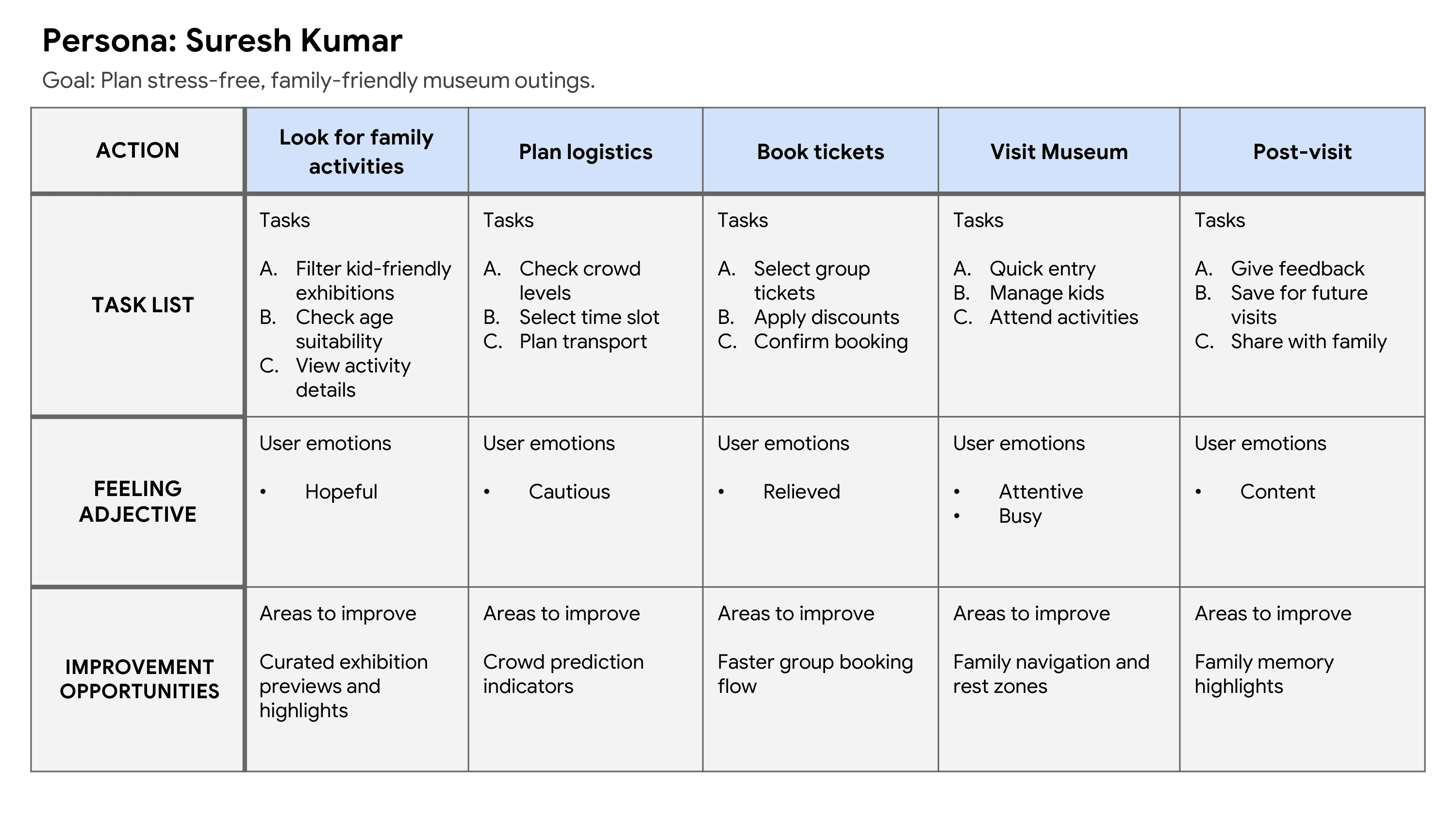
Personas created from interviews and surveys
Problem statements defined across visitor types
Usability Testing
Round 1 Findings:
Add-ons clarity issues
Ticket flow confusion
Overloaded summary
Round 2 Findings:
Reduced distractions improved confidence
Audio guide emphasis adjusted
Quantitative Results :
100% did not find app unnecessarily complex
100% would not require technical help
Majority rated ease-of-use positively
Feedback directly shaped refinements.
Final Solution
The final solution includes:
A mobile-first museum app
A calm, structured homepage
Clear exhibition discovery
A guided ticket flow
Time-slot selection
Optional add-ons
Transparent pricing
QR-based confirmation
An integrated museum map
An accessibility-first approach
Audio guides and multilingual content
Membership tiers
A booking flow for schools and groups
The experience feels:
Organized, culturally rich, modern, and intuitive.

Impact
From usability reviews, participants described the app as:
Calm
Structured
Museum-like
Easy to follow
Less mentally demanding
Users knew:
Where to start
What to do next
How much they were paying
How to complete the booking
The redesign made discovery, booking, and navigation easier.
Reflection
This project changed my way of thinking.
What I Learned
Designing flows is more important than designing screens.
Visual hierarchy can clear up confusion without extra features.
Progressive disclosure helps reduce anxiety.
Small choices, like spacing, shadow, contrast, and call-to-action clarity, greatly enhance usability.
Cultural design needs restraint, not decoration.
Accessibility makes the experience better for everyone, not just for a few.
If I continued, I would:
Conduct more usability testing with different age groups.
Test preferences for content depth on mobile.
Expand post-visit features like saved exhibitions, feedback, and membership engagement.
Introduce personalization and recommendations.